20120107

SAM

I remember going to SAM at least three or four times before in the last three years, but I only have a record of pictures taken from the two trips in Sec 2. I took many pictures... pictures of the artwork I found interesting. the pics shown here are the ones I liked the most out of the several I took. The problem is, I forgot to record down the names/titles of these artworks and their artists and their mediums so I can't exactly label them... T^T 

This first art piece was done on a large piece of paper and stuck onto the wall in such a way that it looked like the picture was actually drawn onto the wall itself. I find this one quite cool, intriguing, creepy (ahahahaha... ^_^) and interesting (mostly because its creepy.) It's black and white and I think it was done using charcoal, which gave it a really haunted kind of effect... like the very picture of death or something. The whole thing depicts a hell lot of tortured looking people, limbs and faces merged together in a mass of twisted black and white. the contrast and shadows are nice. You can see where I get morbid inspirations from. hehe XD


This second art piece was done on a canvas, so I'm assuming that its either acrylic or oil (the latter being the more likely.) I was attracted by this piece of art because of its bright and vibrant colors and realistic depiction. At first glance, you could almost believe that this was a photograph of a boy sprawled on his table top, a glass jar in his arm with a study shelf in the backdrop. Upon closer inspection, you can see the various items that make up this almost realistic piece of work: the books (two of which looks like the science o-level text/guidebooks I bought last year), some cds and dvds (which can also be found at home) an alarm clock, spiderweb (which I have observed several times and have tried to learn how the artist painted them so nicely) and last but not least, various containers (cups, jars, bottles) that each contain a miniature version of the main (and 'original') boy sitting at the table. The mini-boys are mostly either  relaxing, sleeping, reading and they see to represent the main boy's various selves. One of the mini-boy is depicted punching a hole through the glass of the jar he is 'kept' in, and there is a mini-boy sitting in a flask with a starry night picture streaming into (or out of?) it from the illustration of a van gogh book. There's even a boy in a cup of water with a black goldfish in it! I love this sort of surrealistic stuff.


This third art piece consists of a sprawling rose plant cut out of one giant piece of white paper. It also occurred to me that the overall shape of the rose plant seems to form a double helix DNA-ish shape... hmm... anyhow, I was really impressed by how the artist cut out and form all those trailing leaves and rose blossoms. Just drawing a rose is hard. Cutting out a rose is even harder. using one giant pieace of paper to cut out a rose plant is nigh impossible for me. Origami rocks!


This fourth art piece consists of a circle/cluster of glass spheres hanging above a silver reflective mirror-like platform and shone upon by a spotlight. This causes each glass sphere to gleam like lanterns or shining globes/bubbles and due to the dark background, the stings by which the glass spheres hang are near invisible. below the glass spheres, the reflection of the spheres upon the silver surface resembles hundreds of black circles of different sizes. The effect was quite mesmerizing.


The last art piece is a shelf filled with bottles and bottles and more bottles. XD I'm not sure what could have been in those bottles... snuff? drugs? random chemicals? I like to think its poisonous... hehe. i think the designs on the bottles are interesting though and the overall look of the whole artwork. And after looking at all the above artworks... I'm stating to feel  stress and depressed about the thought of having to come up with a satisfactory coursework (yes friends, laugh all you want. i know you know by the time I really do feel stress, yo would be suicidal).


20120106

BeiJing Halloween

Two pictures I took in BeiJing, both were taken in the garden of the Forbidden City. The first pic is of a tree trunk. The cool thing is that it looks like there's a mutant animal head sticking out of the tree trunk cuz the bark in there is of a different color than the rest of the tree trunk. A few of my friends (and family) got a fright when I showed them this pic. This interest I have for this particular picture may be the reason why I like to draw things that have morbid stuff (like skulls) merged with it.


The next pic depicts a skeletal tree. because I didn't use flash, the tree appeared black against the sky and I like the contrast. I can almost imagine a black hand clawing at the sky with many twisted fingers... or the whomping willow from Harry Potter. Come to think of it, I wonder why this tree is so bare and has a lightning-struck look....

BeiJing doodles

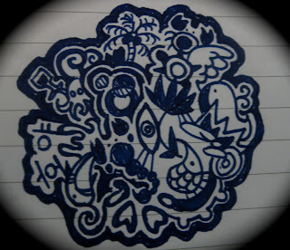
Just to let you know, the artworks I post up here aren't in chronological order. Okay, so the next few pics are of the stuff I drew during my GCP trip in BeiJing. The first four are designs my roommate, Kai Li requested me to make. The first one was originally something I drew without any intention for anything (except maybe alleviate my boredom) but halfway through, when i was asking my friend what else should I add to the cluster of random little things that I was drawing, she said "Hoya" which was the name of some k-pop guy she's crazy about, so i added his korean name in it. In his design, you can mostly see items I would relate to water or bubbles or round-ish stuff, such as a coconut tree, a whale, a shark, a scorpion (which taste like ebi tempura), an eye, a turtle, octopus et cetera.


The second one was done with the Alice in Wonderland theme in mind, so you can see the Cheshire cat in the middle, circled by the dormouse, red queen, tweedledum&dee, white rabbit with his giant pocketwatch, mad hatter, Alice herself with her face colored in black, and a unicorn (which is a character from the Alice in Wonderland book written by Lewis Carrol--not the one by Disney) Then, in her usual fashion, Kai Li pops in and insists I do something for "L"(that's his nickname, I forgot what his Korean name is)(oh and this is another K-pop guy from the same band as Hoya and is the obsession of another friend of mine) since I 'did something for Hoya'. So the block and square background of the Alice in Wonderland icon (i honestly do not know what you call this sort of thing) was inspired by doors, books, Cubism (I can't believe I'm saying this) and the letter L.


The third one was specially requested by Kai Li. She told me to do something for Jill (another friend crazy over the same k-pop band, particularly someone named... darn it. i can't remember what's he called) and so I made a design for her with the korean name of Jill's 'idol' (which i do not remember and cannot read cuz its korean) in the middle and added a ball labelled 'netball' in one corner cuz Jill's a netballer.


The fourth one is the last of the unintentional k-pop series (how on earth did my lovely innocent designs end up with k-pop??) and was designed for Kai Li (again) who wanted a logo (finally, I found the right word to describe these!) for that particular K-pop band (which I have no care for... what I care for is the design) called 'Infinite'. So I wrote the korean words approximately in the middle in bold, I drew their 'infinite' sign behind the words and added my usual little elements around it, using squares, blocks, the outline of a cog/wheel/gear, the four suits (heart, diamond, clover, spade) of poker cards, a fish-like design that I took from henna drawing and the erratic heartbeat lines that form the word 'Infinite Ftw'. This one was done on a black sheet of paper with a white pen.


The last one was 'a tribute to Domo'. Domo is a... brown thing with two round blank eyes, square-ish body, stumpy limbs and a giant mouth with sharp teeth. It's something like Hello Kitty in the sense that it is becoming an increasingly common design you can see on pencil cases, wallets, bags et cetera. Anyhow, like most of my other logos, this one is also drawn with a rough circular 'outline'. This particular design isn't quite asa satisfactory as the previous few though. I didn't do any planning (spontaneous works better for me) beforehand (though I should have done a rough sketch instead of using the pen straightaway I guess) so I think the 'composition' is a bit unbalanced. Ah well, at least it seems to have influenced my dear friend Kai Li into going crazy about Domo.

Death of Caesar

Okay, so this is my first post... don't really know what to say... I think I shall start with the background of my blog title. I call it Caesar Salad cuz it was inspired by Julius Caesar and I don't know if you can see it clearly, but there are like humans er... forming the blood/cap of the toadstool (toadstools are poisonous by the way) and the stalk of the fungi has skulls merged with it. A bit morbid, but you know me... loves sadistic pineapples but before pineapples, i was crazy over mushrooms and toadstools don't ask me why. I did this last year and I intended it to look creepier... don't know if I succeeded in that aspect. The lemon slices, cherry tomatoes, and random vegetables are just there as food deco, and to contribute to the 'salad'... the main subject is, of course, the toadstool. I've always imagined this kind of poisonous mushrooms as red and white. The red was convenient as not only does it say: warning! I am poisonous and not to be eaten! but it's also the color of blood (albeit a bit too bright red for real blood but i thought this shade of red would stand out more so...) As for the stalk, I didn't exactly color it white cuz white is a bit too plain and I don't think the stalks of real mushrooms and toadstools are really white anyways, so I used beige and conveniently added skulls (which are also things that are white-ish in color) to it. I used the melting wax of candles as reference for this part.  Did I mention the toadstool is black/hollow inside and is purposely colored to make it look half rotten? And the part where the knife (yes, its a knife, although apparently, after what some people said about this artwork, it looks like a spoon. Does it??) cuts through the cap of the mushroom was inspired by all things slimy, gooey and gruesome. The rotten part of the fungi was also made to have a vein/blood vessel/root/parasitic look. You can imagine my delight when I was told we were going to dissect a pig's heart later in the year. This was done using color pencils, a black, a red and a white pen. oh well, the original's below (the pic above was slightly edited using... i forgot. Photoshop i think):