20120813

P.V. (Personal Values from my Point of View)


This artwork is by Rene Magritte, titled Personal Values or Les Valuers Personelles. The artwork is done in 1952, depicting the interior of a bedroom. There are seven main items depicted: The comb, the bed, the shaving brush, the armoire, the soap, the glass and the matchstick. The bed is neatly made in one corner of the bedroom, a large patterned comb resting on it, an armoire in the other corner with a shaving brush resting on top of it, a piece of soap in front of the armoire, a turquoise wine glass in the foreground and a matchstick lying on the ground beside it. The wooden bedroom floor is carpeted, the walls are painted to look like the sky, and a window can be seen reflected in the mirror of the armoire. Though the objects seen in the room seem ordinary, they are painted into strange sizes and warped proportions, with the comb, matchstick, wine glass, shaving brush and soap appearing larger than the bed and the armoire. 

In this work, the subject matter is about the value of such everyday objects than about the objects themselves. The exaggerated size of the objects could reflect on the value it holds to the artist. The comb, shaving brush and soap are all items used for personal care. The soap is used for personal hygiene, while the comb and shaving brush are used to groom oneself for one's appearance in society. This is why these three items are depicted larger in size as compared to the rest of the room, because they are considered to be 'more important'. However, the careless placement of the shaving brush atop the armoire suggests that the artist still feels the need to be more free within his own personal room, while away from the eyes of the society. 

The walls of the room are painted to depict the sky outside. The sky is light blue with fluffy white clouds, and it represents the boundless imagination of a person that cannot be trapped within an enclosed space. The painted sky contributes to the slightly dream-like and surreal feel of the painting, along with the distorted proportions of the objects in the room. As the room is painted very realistically, with invisible well-blended brushstrokes and shadows that give the painting depth, the strange unreal sizes of the objects in the room is further emphasized. The room somewhat reminds one of a dollhouse with doll-sized bed and armoire, but with the inclusion of real, normal sized everyday items (the comb, matchstick, shaving brush, wine glass and soap), which, in this context, seems invasive as they grace the room with their intimidating size and seemingly unwelcomed presence. The room also somewhat reminds one of a scene from Alice in Wonderland, with weird, almost-nonsensical, random, surrealistic and disproportionate composition.

Below is my version of Personal Values:


This is a photoshop-ed (I know, my photoshop is quite fail) picture of my (very messy) desk. Most of the items depicted in the photo are of normal size, except for seven chosen items which I value more than the other stuff on the desk. Their arrangement is of no particular order as they are all more or less of the equal importance to me. The first is the white clock. It is a time-keeper of sorts and keeping time is important in the life of a student. In fact, time is important for many, student or not. Meeting deadlines and punctuality are important aspects of a person living in today's society. The second item is the calendar, which serves a similar purpose with the clock. It helps me keep track of deadlines, test dates, competition dates, appointments, birthdays etc. These keepers of time helps one keep up with the fast pace of life in this century. The third item is the piece of yellow post-it note. The post-it note serves as a reminder, a memo for me. I write many notes of various content on similar post-its, from lists of song titles I should check up on to ideas I have for art to keeping track of my pocket money and my expenditure. As such, it is quite important to me, because I tend to be rather forgetful at times.

The fourth item is the red pencil. This piece of stationery is one of the most useful items I could have as it has many uses. The pencil can be used for writing, arts and maths. As a student who likes art, the pencil is very useful and of great value. The pencil records down ideas, inspirations and many more. Plus, pencil lead can be erased while pen ink cannot. The fifth item is the eraser which is as equally useful as the pencil. It allows one to erase one's mistake. That in itself, is enough of an explanation for why it is so valued by me. Without the eraser, my work (art or otherwise) would be a mess and full of flaws. The sixth item(s) are my notebooks. They are slightly different from post-its as post-its are more temporary. My notebooks store my notes which I will require for exam revision. The notebook with the orchid print is my pineapple notebook, also my AEP notebook. It stores my AEP notes as well as all of my pineapple drawings, which are some of my prized possessions (and artwork/"masterpiece"). The last and seventh item is the set of color pencils. They too, are part of my collection of valued stationery. They lend color and life to my plain black and white drawings, helping me turn my rough sketches into proper artworks. It is surprising how much a plain old set of color pencils can do. They may not be oil paint (a medium which the great artists seem to always use), but they serve me well enough.

20120811

Eyes and Hearts


Spying Lens is an artwork done by Lucia Hartini in 1989. In the foreground, there is a woman curled in a fetal position and enveloped in silky azure blue cloth. in front of her, there is a diagonal brick wall that is half-broken. Below her is what seems to be a cracked stone ground, and it can be seen that she is floating in midair. The cloth that wraps around her floats, drifts and twirls throughout the painting, over the zig-zag walls that continue from the foreground all the way into the background where it vanishes, seeming to imply that it continues on forever into the horizon. In the mid ground and background, a gloomy dark blue ultramarine sky can be seen, with red tinted clouds drifting around the walls and turning into white mist and it seeps into the walls towards the woman. Disembodied eyes with emitting light beams from their pupils can also be seen floating around the woman, watching her as she sleeps. 

The entire painting is painted rather realistically, in the sense that the woman looks like a real woman, the cloth looks real, the brick wall looks real, and even the disembodied eyes look like real eyes (albeit eyes from some horror movie). The brushstrokes are fine and carefully blended to appear invisible, and the painting isn't abstract in terms of composition, with appropriate shadows painted to give the painting some three-dimensionality. In the painting, the zig-zagging walls that recede into the background gives the painting a sense of space perspective.  The soft flowy edges of the blue cloth contrasts with the hard angular edges of said brick walls. However, the colors she used seem somewhat arbitrary, with an intense color scheme comprising mostly of blue, red and orange.  coupled with the realistic way she has painted the painting, the painting seems suite surreal and reminiscent of a dream (not a very pleasant one, it seems.) 

In this painting, Lucia Hartini has used Symbolism to subtly express her emotions and thoughts through her painting. The woman in the painting seem to represent herself, trapped in a vulnerable position with the zig-zagging brick walls representing the rules of her society confining her. The eyes that can be seen floating about, watching the woman in the painting creepily, represent the watchful and scrutinizing gaze of her society on her behavior and actions. In the background, the bleak and dark sky reflects the artist's outlook on her life, while it could also mean a distant freedom out of reach. 

Below is another painting, this one done by Frida Kahlo:


This artwork is called The Two Fridas, done in 1939, after her divorce with Diego. This artwork is believed to be an expression of Frida's feelings at the time. The first Frida depicts her heartbroken self, the Frida that Diego no longer loves, with the ripped bodice of the rejected Frida exposes a broken, damaged heart. The surgical pincers held by the unwanted Frida staunches the blood flow of the open vein that could possibly be the vein representing her ties to Diego. In this sense, it can be seen that she has tried to sever these emotional ties. Blood drips onto her crisp white European dress, a possible reminder of her abortions, miscarriages and many surgeries, as well as the physical pain felt at the loss of Diego. The second Frida is the Frida that Diego still loves and is dressed in clean traditional Mexican clothes. In her lap, she holds a miniature portrait of Diego. This Frida has her heart superimposed on her chest which appears whole and healthy, unlike the heart of the other Frida. The two hearts are linked by a blood vessel, representing the link between Frida's two selves, and the background is gloomy with ominous clouds. This could also suggest at the dark atmosphere around Frida's life after her divorce.

Like Lucia Hartini's Spying Lens, this artwork also seems surrealistic and makes use of Symbolism. Both artists use symbols in their artworks to convey their feelings into their canvas and both artworks are rather negative. Spying Lens' main message is of Lucia Hartini's trapped position in her society while The Two Fridas main message is of her divorce. The symbols used in both artworks are also slightly similar, as Lucia Hartini used eyes to represent the watchful gaze of the society while Frida Kahlo used hearts (another organ) to represent her love. These two symbols are also more obvious and direct and viewers can understand the artworks and the artists through these symbols. Both artworks also have compositions with a dark sky in the background to emphasize on the bleakness of the artists' situation.


On a side note: I chose The Two Fridas because, as some of you may know by now, I like this sort of morbid stuff. It is evident in my pineapple drawings too. And my caesar salad. 

20120730

Pineapple Invasion I

Okay, so I know I've been stalling, and I shouldn't stall any more... I hope nobody minds that I didn't photoshop my art much cuz I'm no good at digital art. Besides, I think I prefer to preserve these pineapples in their original form, like how they look like on my pineapple aep notebook, since that's how I remember them as and would like to remember them as (memories~). The notebook was originally meant for my aep (Art Elective Program) notes, but I only wrote my notes on one side of the paper, so I began to doodle on the other side of the paper. I can only tell when I started the series by checking my notes... and since my first notes were about Expressionism, which was what we learnt in sec2, I must have began my series around then. There are 40 pages of pineapple drawings in total, with 300 pineapple drawings. I won't be showing all the pages though, maybe just 30+ pages, and I'll be separating this into 7 posts, which each post showing around 4 to 5 pages of pineapples.

Enough with the babbling. Here's the first page:


Though the pineapples drawn here aren't very nice, but hey, I just started. And I'm showing this page cuz I think I should show how my very first pineapples looked like and how the whole series started. The number written beside the pineapples can be kind of misleading... it doesn't show the order in which the pineapples were drawn--the numbers are just for me to keep track of the pineapples I've drawn. The first pineapple depicted is, well, a normal pineapple, albeit simplified and cartoon-ified. Most of my pineapples are like that--the only features that define them as a pineapple are the round-ish shape of the pineapple's body, the spiky leaves on top and the criss-cross lines/pattern that represent the spiky "scaled"-skin of a pineapple. The themes of the other pineapples are as follows: Shot by an arrow (with juice spurting out like blood); Drowning; Sliced (for eating); Roasted over a flame; Cycling/Fleeing; Vampire Pineapple; =_=||| Pineapple; Grim Reaper Pineapple; Giant Pineapple. I guess I could have edited those pineapple drawings of mine, but I wanted to preserve how awful they were when I first started drawing them (so that I can point at them at a later date and laugh). Lolz.

'Kay, so here's the next page:


So the pineapples have gotten more gruesome... I know. The first pineapple depicted there (no. 66) is simply about a pineapple splitting its skin into half. Inspirations: Evil clowns. That pineapple was the one that really got me into continuing the pineapple drawings and in the end, turning it into a series. This isn't actually the original. The original was much nicer (my originals are always nicer... I can't seem to draw a perfect copy of anything) but it was drawn on the whiteboard and had to be erased later... so I drew a copy of it into my pineapple notebook later. After having drawn it on the whiteboard, some of my classmates began to leave comments beside it (we're an aep class, in case you haven't realized that by now) and most of them seemed to like the pineapple... so I drew some more. The themes of the other pineapples are: Partial-disembowelment/decapitation; Dissolving; Soul-fly-away-shock; Rotten pineapple; Devil; Angel; Bloody cactus; Disgust; Carnivore; Shattering-self. That last shattering pineapple is one that I like a lot, mainly beside this was my first (and last) time that I was able to draw out such an effect nicely. As for what any of these pineapples mean, well, I'll leave them to your interpretation, cuz I never really meant them to mean anything.

This is the third page in the notebook:


The first pineapple depicted here was inspired by a typical anime flowers-appearing-out-of-nowhere-in-the-background scene that usually takes place when the character is in a really gay (definition: cheerful, merry, "high") mood. The next few are mostly inspired by natural stuff. The themes are: Rainy day; Pineapples everywhere; Hot springs; Eskimo; Night; Music; Sunburnt; Tornado/Hurricane; Lightning strike; Um.... I think no. 65 should be... tweeting? Like "fishing"? But "fishing" for birds that leave behind text as they fly past? yeah... one of the few pineapples that has a proper meaning behind its drawing. 

Moving on to the fourth page... also the second-last page for this post:


The first drawing depicts a pineapple using a sparkler (you know, the long colorful stick you light up with a flame and it starts shooting out sparks like a mini firework?) to um... that's a snail by the way. The drawing was inspired by the time when my cousins and I were celebrating the Mid-Autumn Fest and we found out that if one holds a sparkler very near a snail, first, it'd retreat back into its shell, then the slimy thing in its shell i.e. the snail will start to bubble and uh... yeah. And the shell will start to form grey-white stuff that could be ashes and... I shall not say anymore about killing/torturing innocent creatures. The next few pineapple themes are: Stuck in time (hourglass) (YES!!! another pineapple drawing with a proper meaning behind it!!); Accidents; The Scream (by Munch): pineapple version; Food chain; Wanderer Above the Mist (by Friedrich): pineapple version; La Musique (by Matisse): pineapple version. No. 26, no. 28 and no. 29, as you can see, are inspired by some of the artworks I learnt about during aep. 

Now, the last (but not least) page for this post:


As you can see, most of these pineapples have been inspired by the school stuff. The first pineapple was inspired by physics. P.E. stands for Potential Energy and K.E. stands for Kinetic Energy. If you want to continue digging into the meaning behind this pineapple drawing, well, look at what its doing and you can see how that links to my idea of physics at that time: "suicide". Haha. And the next pineapple was inspired by the idea I picked up from the net about paintings coming to life. And there's the barcode pineapple. And the pineapple that got sucked into the stuff it was writing. The last pineapple drawing was inspired by chemistry. And yes, both my pineapples AND Chemistry are EVIL.

Hm. That's all for now... Will post another few pages up soon... Do not ask me to define 'soon'.

20120714

Escher Alchemy

Introduction

M. C. Escher: One guy whose works defy science. He is known for his woodcutslithographs, and mezzotints. These feature impossible constructions, explorations of infinityarchitecture, and tessellationsOne example would be Reptiles (1943)--of which a picture of it is shown below. Impossible construction: the lizards depicted in the artwork come to life from a drawing and start moving about. Exploration of infinity: The lizards merge back into the drawing after going in a circle across the workspace depicted in the artwork--a cycle has no end. Tessellation: The drawing of several hexagonal-based reptiles and origins of the moving lizards. 


Analysis

In this artwork, M. C. Escher has clearly used several elements and principles of art and design. First of all, by using lines, he marks out the rough geometric shape of lizards in his tessellation. The main subject matter of the artwork also contains the implications of a circle. This is achieved by positioning the lizards in a circular orientation and using their bodies to suggest the shape of a circle. The way the lizards are positioned, as well as having them merge in and grow out of the tessellation, gives them a sense of movement, making them seem like they are moving across the table top, up and down the items displayed there. Much of the artwork seems three-dimensional, an effect achieved by the realistic proportion of the items depicted in the lithograph as well as the shading and use of chiaroscuro to give the artwork solidity, depth and value. By using the slant of the sketchbook (the one the lizard tessellation is drawn on), the circular motion of the reptiles and the various items decorating the tabletop, Escher was also able to create balance and a sense of equilibrium in his artwork.

This artwork is in black, gray and white, which gives the art piece a certain dream-like, surreal and mysterious feel. It also suggests a sense of antiquity as it isn't colored, like the photographs and films of earlier centuries. Other than making the artwork seem more angular, the books, the set square, the dodecahedron, the box in the metal cup and the tessellation gives the idea of alchemy in the art work. The presence of a corked bottle and a small glass also contributes to that effect, as well as complementing the angular nature of the other items. The surreality of the artwork can be seen through the very fact that the lizards are coming to life from a drawing and that one of the lizards seem to be blowing smoke from its nostrils--something that cannot be achieved in real life. The animated reptiles also reminds one of golems of myths and fantasy. Another idea that the artwork seems to suggest is that of reincarnation and a cycle of life, death and rebirth, as shown when the lizards first come to life and move out of the drawing, only to merge back into the drawing as an inanimate, two-dimensional creature.

Comparison

Below is an image of a painting done by an artist called Kurt Wenner. He is best known for his invention of 3D pavement art. Wenner was inspired by anamorphic perspective, but had to invent an entirely new geometry in order to create his astonishing 3D pavement art images. The art work depicted below is one of his many creations. 


Dies Irae (2005)


He created this piece of street art on the pavement of a medieval town square in Italy with chalk. The artwork above is from a poem called "Dies Irae" which discusses judgment day for all in front of God.  This art piece incredibly captures the emotion and despair of those doomed to the underworld. This work is one of many of Wenner's interest in Renaissance classicism interpretation. Similar to Escher's art, there is a vague sense of movement in the art as the figures depicted in the artwork seem to be struggling in agony. The figures depicted in the artwork also contains an illusion of the subject matter coming to life from the artwork as they seem three-dimensional. This effect can only be properly seen when the viewer is looking at the art piece from this particular point of view, however. If one walks around the art piece, the illusion would no longer exist. There is also a surrealistic and mystical feel to the artwork due to its subject matter and color, just like that of Escher, as well as a strange yet seemingly normal perspective. Both artists have chosen to depict their artwork as realistically as possible so that its strangeness can be emphasized. However, Wenner's work is two-dimensional but seems three-dimensional, whereas Escher's is a two-dimensional piece of art about something two-dimenisional becoming three-dimensional. Their subject matter is also different but both seem to have have mythical origins.


Below is a video of Escher's Reptiles.


20120330

SAG--Spirally Andy Goldsworthy

This is an artwork based on the artworks of Andy Goldsworthy, an artist we--AEP students--leart about recently. Andy Goldsworthy's artworks are mostly nature-based, such as the Ice Spiral: Treesoul. They are mostly beautiful and captivating pieces of art. We were assigned to present on an artwork of Andy Goldsworthy and create an artwork of our own based on his kind of art. 


The artwork my friend (Lero~) and I chose to present was Ice Spiral: Treesoul, which is consists of a conicle spiral of ice suspended around a tree trunk in winter. The gleaming crystal-like quality of ice contrasts with the dark earthy tree trunk, and when the light reflects/refracts in/on the ice, it gives it an ethereal quality, hence the title of the work--Treesoul, the soul of a tree, sleeping in winter. More artworks of his can be viewed at this website: http://www.morning-earth.org/artistnaturalists/an_goldsworthy.html


Spirals within a Spiral: With the idea of spirals and nature in mind, I came to the think of shells and how many of them consist of spirals. So I chose to work with seashells and arranged them in a spiral with a color gradient, from dark inside to light outside. The shells were mostly light colored so I displayed them on a dark wooden floor for contrast. The end result is nothing like Andy Goldsworthy's lovely artworks, which helped me to appreciate his artwork even more.

The Guy With the Funny Moustache

Last year, I went to the Art Science Museum to see the Dali exhibition there. I've always liked most of Dali's works ever since we--the AEP students--learned abut him in AEP. I only took pictures of the artworks I liked better, and you may notice that I do not take entire pictures of some of the artworks, and that's because I only focus on the part of the artwork I like. I know that may spoil the beauty of the artwork, but I prefer to avoid taking pictures of any nude figures. 


I won't be introducing the pictures I took in the order I took them, but according to how I classify them. The first five pictures are of Dali's famous melting clocks. There were many of such sculptures, but I chose to take pictures of only two to represent the rest. I like the idea of melting clocks and relativity of time. Like the warping of time. Melting time: The first picture depicts a green and gold melting clock by itself, while the second picture shows a bronze clock melting on some tree branches. The third picture is more contemporary. It depicts a  dark blue melting clock with golden numerals hung on a clothes hanger. 

Horse Saddled With Time: The fourth picture depicts a green and gold (this seems to be Dali's preferred color for his melting clocks?) clock melting on the back of a horse where a saddle should be. Its like the horse is carrying away the burden of time and time passes quickly (since the horse is a fast animal). Woman of Time: In this picture, a woman is dressed in flowing robes, holding a rose in one hand and a melted clock is draped over the other arm. The clock alludes to the woman's awareness that beauty can be independent of time, whether it is corporeal grace or an ethereal rose.


The next few pictures have been classified by me under the category of women and angels. Woman Aflame: this picture is of a woman, almost entirely composed of flames and combines a few of Dali's obsessions together (woman, fire and chest of drawers) The flames represent the erotic impulses of the female figure, and drawers are a representation of the concealed sexuality of women (eew!). Dali portrays many of the drawers to be slightly ajar, indicating that their secrets are known and no longer to be feared. Alice in Wonderland: In this picture, Alice's hands and hair have blossomed into roses and her jump rope has become a twisted cord. Hmm... Surrealism is about reality in dreams. Alice in Wonderland is about dreams too. No wonder Dali got inspiration from Lewis Carrol. Adam and Eve: In this artwork, the Garden of Eden is portrayed with Adam, Eve, and the serpent, capturing the very moment Eve offers Adam the forbidden fruit. In the artwork, the serpent tempts Adam, coiling himself in the shape of a heart, reminding Adam and Eve of their love for each other. I apologize for not taking a picture of the entire artwork (there was a lack of clothes).

Snail and the Angel: This picture is of a snail and an angel on top of it (the proportion seems weird). Paradoxically, the snail, the universal symbol of the idle passing of time, has been given wings and is riding fluidly moving waves. In the picture, the angel, a winged messenger of the gods, capable of limitless speed, bestows the snail with the gift of motion by touching down on its back for the briefest of moments. Vision of the Angel: In this sculpture, the strength and supremacy of God is represented by a thumb from which all life emerges (as represented by the branches). On the left is an Angel in The Thinker pose, with his wing resting on and supported by a crutch. To the right of this divine being is a man bursting with life's vitality, which represents humanity.


Last but not least are three (or four?) artworks under my category of animals. Lady Godiva with Butterflies: In this picture, the butterflies announce the arrival of Lady Godiva, hovering around her and her steed, as well as adorning her body as she plays her trumpet. Lady Godiva embodies earthly beauty, whereas the butterflies depict the ethereal otherworld. Once again, the picture is weird (having taken it from behind, because of Lady Godiva's lack of clothes). Unicorn: The unicorn is a mythical creature of legend representing virginity and purity. The horn of a unicorn is believed capable of neutralizing any poison. In this artwork, the unicorn's horn penetrates a stone wall through a heart-shaped opening, from which a drop of blood is slowly falling. There is nude female stretched out in the foreground at the hooves of the animal (which is not in the picture for reasons mentioned before) 

Swan-Elephant: I find this artwork one of the most interesting because its kind of optical illusion-ish. The sculptures displayed consist of a silver elephant and a gold swan. But they're actually the same thing. If you turn the elephant upside down, you get a swan. If you turn the swan upside down, you get an elephant. Cool right? 

Most of these sculptures are made of bronze (i think. At least their originals were) and all very surrealistic. I came to this art exhibition with my parents because my dad said it would be good for an AEP student. On that day, there were two exhibitions going on and he gave me a choice: Van Gogh or Dali. I chose Dali. 


In Case Of Fire, Do Not Use This Fire Hydrant

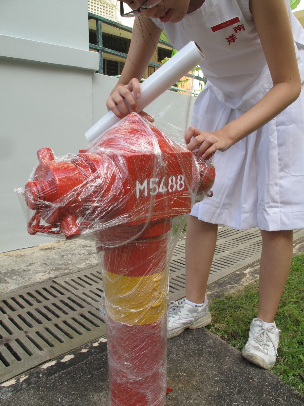
Earlier this year, we AEP students were assigned with a task to wrap something in the school with cling wrap. This task is based on some of the works done by Christo, the artist we were just learning about. We went about the school in pairs, searching for something to wrap. We had ridiculous and unfeasible ideas such as wrapping a vending machine (which would probably get us into big trouble with the school as well) or wrapping a trash bin (the big green ones that can be pushed around on wheels) but in the end, Lero and I decided to settle with a fire hydrant (and up til now, I'm still not sure if that was really allowed, since it would be disastrous if there was a fire and the fire hydrant was rendered useless having been wrapped in cling wrap by us).
Me: Initial wrapping
Second layer of wrapping
Second last layer of wrapping
Here are some pictures of Lero and I taking turns to wrap the fire hydrant, all the while hoping that a fire wouldn't start in the science block while we were doing so. We chose the fire hydrant mostly because of its strange shape and we were wondering who it would turn out after being wrapped with a few layers of cling wrap. It was fun, I guess, especially since the fire hydrant was something we decided was outrageous to wrap, yet not outrageous enough for the school to flay us or something (I hope). Anyway, Christo and Jeanne-Claude has wrapped quite some outrageous stuff before (buildings, a coast etc) and hey, if we're gonna do something inspired by them, it should be as outrageous too, right? Now I'm beginning to wonder if we could have wrapped something better--sorry if my definition of 'better' is a bit warped--like... a person or something... 


This is the finished product of the wrapped fire hydrant. You can still see some red, because the cling wrap is translucent-ish and there wasn't enough cling wrap--but as much as I would prefer the fire hydrant to end up completely opaque, it wouldn't be environmentally friendly so... yeah. I think I like the knobbly look of the fire hydrant. Overall, it actually resembles something wrapped in thick spider web (which is nice~) 

In conclusion, I think I just may understand why Christo and Jeanne-Claude like to wrap things, exploring shape and texture and art. But it's a waste of resources and that's one thing I don't really approve on. And some of the things they wrap (such as the coast) could affect nature quite a bit too. Like the little critters that live there or something. Anyways, this is their website: http://www.christojeanneclaude.net/index.shtml if you're interested to know more about them.

Off topic: We unwrapped the fire hydrant later and there were a little flakes of red that came off with it. At least the fire hydrant remained red enough. I think it had just been newly repainted over the school hols that's why... =="