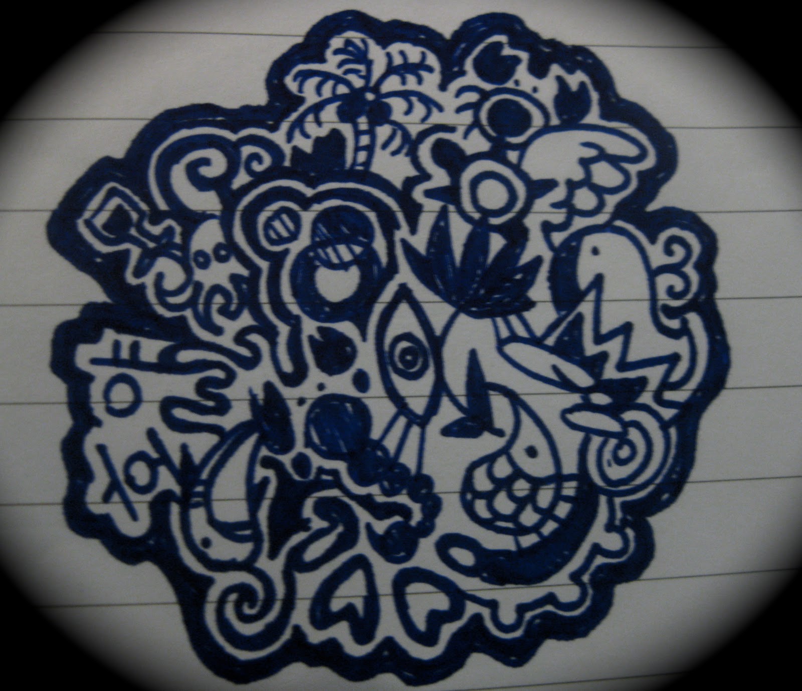
Just to let you know, the artworks I post up here aren't in chronological order. Okay, so the next few pics are of the stuff I drew during my GCP trip in BeiJing. The first four are designs my roommate, Kai Li requested me to make. The first one was originally something I drew without any intention for anything (except maybe alleviate my boredom) but halfway through, when i was asking my friend what else should I add to the cluster of random little things that I was drawing, she said "Hoya" which was the name of some k-pop guy she's crazy about, so i added his korean name in it. In his design, you can mostly see items I would relate to water or bubbles or round-ish stuff, such as a coconut tree, a whale, a shark, a scorpion (which taste like ebi tempura), an eye, a turtle, octopus et cetera.
The second one was done with the Alice in Wonderland theme in mind, so you can see the Cheshire cat in the middle, circled by the dormouse, red queen, tweedledum&dee, white rabbit with his giant pocketwatch, mad hatter, Alice herself with her face colored in black, and a unicorn (which is a character from the Alice in Wonderland book written by Lewis Carrol--not the one by Disney) Then, in her usual fashion, Kai Li pops in and insists I do something for "L"(that's his nickname, I forgot what his Korean name is)(oh and this is another K-pop guy from the same band as Hoya and is the obsession of another friend of mine) since I 'did something for Hoya'. So the block and square background of the Alice in Wonderland icon (i honestly do not know what you call this sort of thing) was inspired by doors, books, Cubism (I can't believe I'm saying this) and the letter L.

The third one was specially requested by Kai Li. She told me to do something for Jill (another friend crazy over the same k-pop band, particularly someone named... darn it. i can't remember what's he called) and so I made a design for her with the korean name of Jill's 'idol' (which i do not remember and cannot read cuz its korean) in the middle and added a ball labelled 'netball' in one corner cuz Jill's a netballer.

The fourth one is the last of the unintentional k-pop series (how on earth did my lovely innocent designs end up with k-pop??) and was designed for Kai Li (again) who wanted a logo (finally, I found the right word to describe these!) for that particular K-pop band (which I have no care for... what I care for is the design) called 'Infinite'. So I wrote the korean words approximately in the middle in bold, I drew their 'infinite' sign behind the words and added my usual little elements around it, using squares, blocks, the outline of a cog/wheel/gear, the four suits (heart, diamond, clover, spade) of poker cards, a fish-like design that I took from henna drawing and the erratic heartbeat lines that form the word 'Infinite Ftw'. This one was done on a black sheet of paper with a white pen.


No comments:
Post a Comment