This is just a comment log. A record of the comments I have made on my friends' AEP blogs. Nothing less, nothing more. I'll probably update this if/whenever I post anymore comments on their blogs.
http://oh-mai-ghandi-oao.blogspot.sg/2012/02/works-at-home-crayons-and-clay.html
http://all-things-aep.blogspot.sg/2012/09/my-coursework-progress.html
http://apeland.tumblr.com/post/31273316386/decay-2011-so-here-you-see-a-mushroom-character
http://hazydreamerneko.blogspot.sg/2012/07/bookbinding.html
http://svenape.blogspot.sg/2012/09/final-coursework-project.html
http://artsy-inspirations.blogspot.sg/2012/05/what-constitudes-true-artist.html
20120916
20120915
inspiration--zeiva
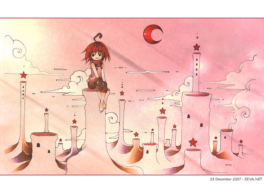 |
| Land of Stars |
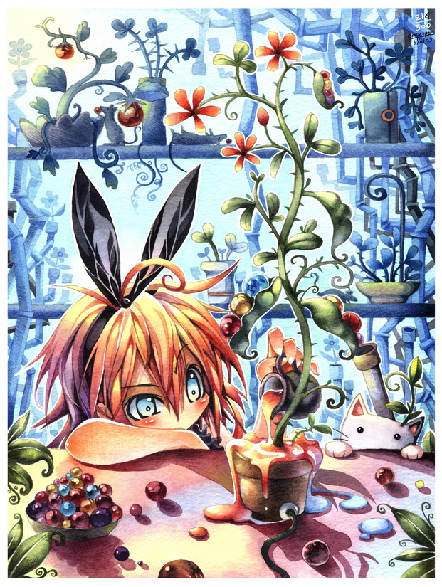
This is the first artist I knew on deviantart (not counting my school friends). Her username is zeiva and her art was my first real inspiration. She works with different color schemes and her artworks range from simple to really complex. The artwork above is one of her more simpler ones and is part of her Stars calendar series. Yeah, she does calendar series too and I love them. The artwork below is part of another calendar series of hers, titled Birthstones. I like the way she uses copic markers and photoshop to do her art. The part I like most (and is most inspired by) is her style/composition.
zeiva tends to have various stuff floating around (I know my description isn't very good, but I can't think of any other way to put it), such as the clouds, moon and stars in the artwork above, the swirling waves in the artwork below, and the egg-like forms in the artwork far below. She also often personifies her characters, such as the little star in the artwork above, the aquamarine stone in the artwork below, and birth in the artwork far below. I didn't realize how much she influenced me until a friend of mine pointed out that many of my compositions tend to have stuff floating in the background (such as apples in my Snow White doodle).
 |
| Aquamarine |
I like the way zeiva uses symbols in her artwork too, such as waves in aquamarine and the cracking eggs and DNA-like thing in the artwork below. She also tend to have stuff dripping in her artwork (even stuff that shouldn't drip), such as the water in the artwork above and the DNA strand and egg yolk in the artwork below. The effect is quite interesting and I sometimes adopt it in my doodles. I have yet to create a proper artwork with her influence, though.
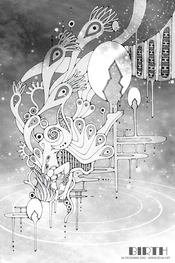 |
| Birth |
inspiration-emperpep
 |
| Poisonous Maiden |
Another example of her art is the painting below. Once again, it looks so well done that it doesn't look like its been painted. The painting is a kaleidoscope of colors (even the girl in the painting has rainbow hair) and the setting of the painting is a very colorful, very messy, and very artistic studio. The studio is full of paintings, paint, colorful plants and creatures (that seem to have either come to life from the painting, or come to life from the artist's overactive imagination). The way the artist blends her colors is also admirable. What I like most about her artworks, such as the one below, is that she always seem to be able to paint stuff with so much detail, yet the composition doesn't seem messy. Or maybe you could call it an organized mess? In any case, I'm still trying to create such an artwork (not with watercolor but with color pencil, since I think I should master color pencil first, before thinking about anything harder) but I've been unsuccessful so far... And in truth, I don't think I'll ever be able to reach this artist's standard.
For those who are interested, this is the artist's DA: http://emperpep.deviantart.com/
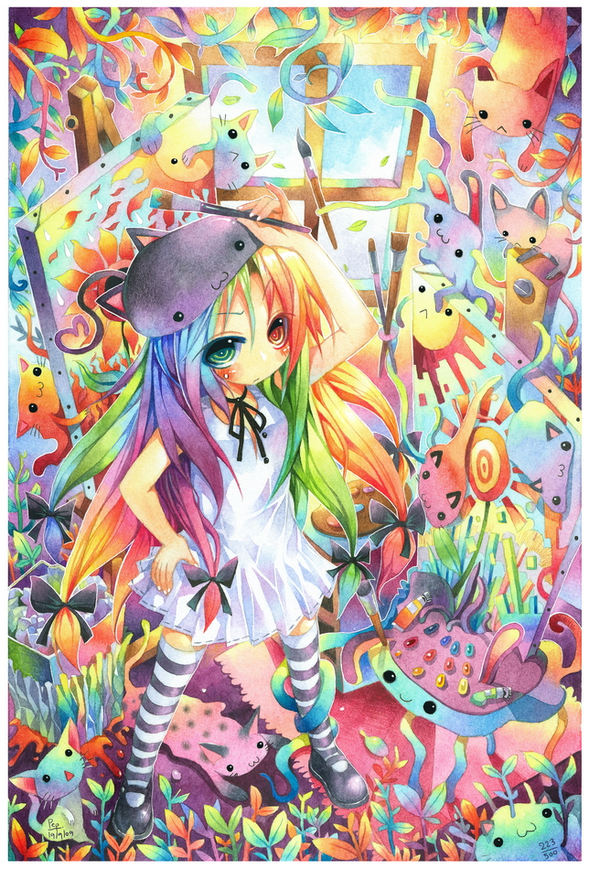 |
| Psychedelic Studio: 223 |
inspiration--eyeballing
 |
| blind |
 |
| lies and disguise |
The artwork above is about a conversation with friends, though everyone has a 'mask' on and the words they speak all contain lies. Its quite an interesting concept and I love the way she has portrayed it, with masks representing disguises. The artwork is sinister and melancholic and the way she uses different mediums together is also amazing. The artwork below is above an abandoned violin meeting a broken piano. Both musical instruments have been personified (and you know I love personification) and it can be seen that the piano lady's legs are broken (or not in the right angle) while part of the violin's legs are missing. Its an elegant and lovely piece of art and like all her other artworks, the colors she used are very appropriate and pleasing to the eye. I like the way she designs her backgrounds too. Overall, her compositions are really cool.
 |
| the silent note |
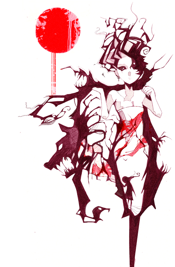
The Fair Reaper

This sketch was done this year when I took an interest in the personification of death. This is the first time I've drawn a proper guy (chibis not counted) that looks like a guy... I think... And I was inspired by a variety of artist from deviantart. This is my idea of how Death might look like personified: His hair is not too long not too short, he wears the chaperone of a jester with a bell hanging at the end of the hood's tail, beneath the chaperone is a diamond-patterned harlequin-like shirt with long loose sleeves, and a pair of slacks with boots (that can't be seen 'cuz its off the paper). Though I didn't color him, I imagined his hair to be white, his visible eye to be silver, his skin to be fair and his clothes to be black and white (the bell will be silver)... so altogether, not much color either.
Since I got the idea of him being an angel of death, so I drew one large white feathered wing emerging from his back on his left side. As for his right side, I thought, since he represents death, he should have part of himself fading away. That's why the right side of his clothes are frayed and his right arm is missing, pieces of it drifting away in the form of falling flowers. The idea of flowers came from the idea of life and death being closely entwined with each other. His right wing is also missing as it has dissolved into mist. Oh, and his left eye is also missing, though I had the missing eye covered by his side-swept fringe. The right side of his face is also cracking, like a broken mask. In his left hand, he holds the classic Grim Reaper scythe and there's a lamp hanging from the handle of the scythe by a long piece of fabric. The scythe would be his tool to reap the souls of the dying, while the lamp is to light his way in the dark.
I think of Death as someone lonely, someone sad, who has the job of taking the souls of the dead to the afterlife. But to those who go with him willingly, he would smile and dance them away in the Dance of Death. He is also fair, in the sense that he isn't biased and takes both the poor and the rich, the good and the bad, and no one can escape him when it's their time. I think I'm quite satisfied with this drawing... it turned out better than I expected. I may consider coloring it someday, or I may leave it as it is, since it seems to look quite alright in black and white.
20120914
A Pineapple Year
The artworks shown below are the calendar pages I designed for this year. Its for my AEP coursework and the purpose of it is to reflect on my (last) year in NYGH. I guess it's a little like a monthly diary of sorts? Each page was a watercolor painting (except October, which is done in poster color and acrylic), lined with a thin marker and occasionally touched up with white pen. I say 'was' because they were all scanned into the computer and I did some light photoshop (my photoshop skills suck) before it was sent for printing. On each page, there is also a small pineapple sculpture made of air-dried clay, painted with a mixture of paints (poster, watercolor, acrylic) and varnished. Each month has a theme and so does each pineapple. I also found quotes on the internet and added one to each month. I think I'm more or less satisfied with my work though I feel that I could have done better if I improved on my watercolor skills and photoshop skills.

January: Chinese New Year~!
Pineapple type: Eat Me

February: Valentine's Day, Science Practical Trials
Pineapple type: Split-skin (a representation of stress and contradiction)

March: GRACES, School hols, Exams
Pineapple type: Enzyme and Substrate/Masquerade (depends on how you want to interpret it)

April: Birthdays and Exams
Pineapple type: Strangled in ribbons (representing both of the above)

May: Relaxation (start of school hols)
Pineapple type: Ice-cream-eating

June: Holiday
Pineapple type: Akuma (representing the enjoyment of anime/manga... and my birthday--because my friends nickname me Akuma)

July: More exams
Pineapple type: Strangled by snake (the horrors of Biology?)

August: National Day (Singapore)
Pineapple type: National Day Parade (NDP)

September: Burning midnight oil (studying)
Pineapple type: Burnt-out candle

October: Final Exam's a war game
Pineapple type: Octopus ('cuz of the super busy month)

November: The End is coming, Autumn (though Singapore has no autumn)
Pineapple type: Mad Hatter (let the fun begin!)

December: Christmas
Pineapple type: Queen of Hearts ('cuz a friend of mine once played the Queen of Hearts in an Odyssey of the Mind (OM) performance and her birthday is on the 25th, and the Queen of Hearts could also represent love?)
That's all. Unfortunately the lighting isn't very good and some parts have shadows where there shouldn't be shadows while some parts are too bright. Maybe I should have taken the photos of my artwork at somewhere where the lighting is even? Hm...
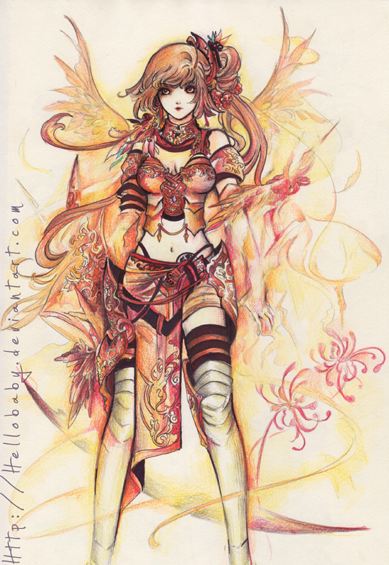
inspiration--hellobaby
 |
| Assassin Girl |
This artist is another one from deviantart. Her deviantart name is hellobaby. I love her style. She's able to draw very detailed art and her shading is very well done. The picture above is one of the ones that she doesn't color, yet it isn't plain or anything. I think its pretty cool how she drew the character suspended upside-down, with hair flowing so nicely. It makes sense that an assassin should have the dexterity and agility to do such feats (like suspending herself from something). The skull hanging beside the assassin in the picture is also quite symbolic as it represents death and assassins are killers. I like the way her clothes are drawn with so much detail and overall, the artist managed to make the assassin look beautiful and dangerous at the same time.
 |
| Chevaleresse of fire |
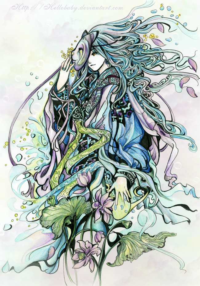 |
| Water God |
The last kind of art she does is the one that's half-colored. Shown below is an example. For the majority of the picture, she leaves it in black and white with appropriate shading, lightly colors (to give the drawing a hint of color so subtle, it almost can't be seen) the skin and clothes of the girl, and fully colors the main focus of her artwork, which in this case, is the heart-shaped balloon-like object that the girl is holding. As the title suggests, the artist's message was to show some love to those around us. That is why the heart-shaped balloon that seems to be blooming into little flowers and butterflies is colored pink, because pink not only means love, but it also means 'I will never forget you'. The touch of pink mixed with tints of peach and soft gold gives the floating heart a warm and pleasant aura/feel. The plainer colors of the rest of the artwork puts more emphasis on the colored area, as if to say that life without love is colorless. I like this effect and may try it out myself one day, and I also like the way the artist conveys her message effectively in this manner.
For those who are interested, the artist's DA is http://hellobaby.deviantart.com/
 |
| Spread the love |
95th Anniversary Card
 |
| Front Cover |
 |
| Inside |
This is the card I made for the 95th Anniversary of my school, Nanyang Girl's High. I wrote the words in pencil first before lining it. After that I colored the edges lightly (maybe a little too lightly?) with color pencil. Then I cut out the words that I had previously lined (with penknife). On the inside, I pasted a black piece of paper because I thought it would be a nice color for the background of the inside of the card. I decided to decorate the inside a drawing of my friends and I celebrating the 95th Anniversary. I did it in a photo format, inserting the drawing into the corner flaps I pasted there as a frame. The picture was drawn, then lined, then colored with color pencil.
The setting of the drawing is the mac lab of the school. In the middle of the picture is a gigantic cake that has nine big candles (the blue ones) and five small candles (the light green ones). The people around it are students waiting to eat the cake. As you can see, the candles are still lit, which means that the cake shouldn't be eaten yet, but two things have happened: a) one student had been hiding in the cake and had happily burst out at that moment, and b) another student had stolen a slice of cake. I guess I drew this with my old class in mind and added the 'crazy' elements into it to depict the way our class may have celebrated the Anniversary if we had been able to (I don't think such a celebration would be allowed in reality....)
People featured in the drawing, clockwise from top left-hand corner: Cat (not an old classmate, but my CCA training partner... she's slightly money-minded), Mr Chang (a teacher who used to wear checkered shirts all the time, and would not be happy if we ate in the mac lab), Komui (otherwise known as Fang Ni, and is the fun-loving prankster-sort of person), me (chasing after the stolen slice of cake) that Lero (otherwise known as Pang Xin) has, 'Tachi (also known as Svena, with her trademark jacket), Hsi Chien (sketching), Yu Qi (with the Eeyore), Hui Tze (with the iPad) and Lenalee (otherwise known as Jia Hui)
I think I'm quite pleased with the result, though I should have improved on the colors which seem a bit too light (?) I especially like the way the light shines through the cut-out words and the solid sections cast interesting shadows on the drawing beneath. As for the message I want to convey through this artwork... YOLO~ ^_^
The Ten Tailed-Kids

Here is a fan art of mine, based on some characters in the manga/anime Naruto. The characters are actually nine tailed-beasts (bijuu), from the one-tailed raccoon-dog (tanuki) to the nine-tailed fox. I've personified them into children-form because I thought it might be interesting. I guess I like personifying things. The boy in sandy-brown colors is based on the one-tailed raccoon-dog, named Shukaku. The two-tailed cat (nekomata) is the girl in blue, named Matatabi. The three-tailed turtle is the boy in gray and brown, named Isobu. The four-tailed monkey is the boy in red, named Son Gokū. The five-tailed dolphin-horse (a fictional creature) is the one in pale almost-white aquamarine, named Kokuō. The six-tailed slug is the girl in indigo-ish-white, named Saiken. The seven-tailed insect is the girl that has the most colors (blue, yellow, orange, green), named Chōmei. The eight-tailed bull-headed octopus (ushi-oni) is the girl in pink, named Gyūki. Last but definitely not least, the nine-tailed fox is the boy in fiery colors, named Kurama. Because they are all based on beasts, they don't actually have a gender, and their gender is usually assumed as male, but I decided that a variety in the genders would be better. So I drew them with different genders.
I'm not as satisfied by my artwork as I wished I was though. I think I could have planned the composition better. Two of the characters are also of lighter colors that seem plain as compared to the other more colorful characters. I guess that may be because I drew this as soon as the idea popped into my mind, first drawing Shukaku, followed by Kurama and then the others, adding more wherever I saw space. In a sense, this was done quite 'spontaneously'. It had also started out as doodles until I thought I should line them and color them to 'give them life' (?) Anyways, I think I like the raccoon-dog, the fox and the cat the best out of the characters I drew...
inspiration--Nanohikakou
One of the artworks done by a deviantart member called 'Nanohikakou'. Her subject matters ranges from cute to sadistic (sometimes both) to... conceptual? Not sure of the term. The pictures show above and below are two examples of her art. Her art is quite stylized and the backgrounds she do are usually kind of abstract-ish.
The picture above is called Maylo Knifears and is about a bunny with knives as ears that it could use as weapons. The idea of a cute animal with weapons as body parts interested me quite a bit. And its funny in a certain way too. The artwork below is called Wearing Fears and features a woman wearing a coat of fears. The coat has ragged and scraggly edges that form jaws, fangs, claws and heads of beasts. The head of the wolf emerging from the coat reminded me of the big bad wolf from Red Riding Hood, and there seems to be the silhouette of a little girl on the skirt of the woman. Overall, its quite a cool picture and the color scheme is quite fitting too.
I like Nanohikakou's style quite a bit and I'm fascinated by the way she thinks and the ideas she come up with for her art. I like the way she lines her art and her use of colors. She usually uses red, white and dark brown/red, and though it may sound boring, but she manages to use the simple color scheme to created quite unique pieces of art. Her art also always seem to be simple yet complicated at the same time. I admire the way she is able to portray and express her ideas in her art. However, I have no intention of imitating her style, and I am inspired mostly by her ideas and the themes she does.
Here's the link to her DA for those who are interested: http://nanohikakou.deviantart.com/
20120913
Firefly

This was done quite a year ago, when I first started writing fan fiction. This drawing is of my OC that I created. I think the waist and hip seems a bit too thin now that I look at it again. But I guess its not very obvious... I created her based on a combination of traits from my friends, with the idea of a personality akin to fire in mind. Like, fire personified? She has short gold-brown spiky hair that reflects her hyperactive character and high energy level. Her eyes are amber, a color that is also fiery. That's why her clothes have flaming designs on them too, as well as drawing a fiery dragon in the background. I like the colors I used for the dragon because it includes pale yellow, amber, vermillion, scarlet and blue. The blue was added because I thought it would give the dragon more color variation and besides, really hot flames are blue. I created the dragon to be either made of fire, in the sense that she created the dragon out of her fire elemental powers, or it could be her familiar of sorts. As for her clothes, its half traditional half modern, because of the fan fiction I created her in. The fan fiction is based on a manga/anime that has a half traditional half modern setting with characters that have elemental powers. Finally, the lollipop in her her hand shows her sweet tooth. She loves candy of any kind and has a childish personality. She is mostly mischievous and loves getting into trouble too. But her tantrums and anger fits are scary. I guess that's all I have about this character I've created... There's another drawing of her below, done this year:

The color scheme this time is slightly different, since I decided that using a yellow, orange and red scheme would be more suitable for her clothes instead of purple. Her hair color is also slightly different, for aforementioned reason. Her jacket is longer than before, her sleeves are long and folded up, her pants are longer too. She isn't wearing a scarf either, and the clothes are more traditional/oriental than before. This is because I drew this picture for another fan fiction, also an animation but not anime. The character is the same, but included in a different setting (?) Like the first version, she's a fighter. Her weapons are usually small long-ranged types, such as senbon needles and shurikens. That's what's in the small pouches strung on her belt and in the second version, the small slots on the inside of her jacket. Oh, and before I forget, her name is Ryuusei Akirai, which means Shooting-star Autumn-lightning in jap. And I think I prefer the second version I drew better than the first.
20120912
Alice's Shadow

This sketch was done last year, when I was caught in the Alice in Wonderland craze (actually, I still am). This was inspired by Lewis Carroll's Alice's Adventures in Wonderland and Through The Looking Glass. The characters/objects depicted in the drawing, clockwise from top left, are: the "Drink Me" bottle, the Queen of Hearts (card), the Ace of Hearts (card), the Cheshire Cat, the Hatter, the White Rabbit, Humpty Dumpty, Tweedledum and Tweedledee, the Red Queen, the Red Knight, Alice, the Caterpillar and the Mushroom, the Dormouse. I didn't color the drawing, so its colors consist of black, gray and white, and this is because I wanted the mood of the art piece to be more sombre.
Alice's Adventures in Wonderland is about Alice falling through a rabbit hole and landing in Wonderland. Through the Looking Glass is about Alice slipping through a large mirror (looking glass) and ending up in the Looking-Glass World. In these worlds that she visited in her dreams, she meets characters such as the this drawing is mainly about Alice growing up and leaving her childhood fantasies behind. That's mainly why I decided to make the sketch more sombre in a sense, because I think its kind of sad when a child grows up and dreams give way to reality.
Subscribe to:
Posts (Atom)