This is just a comment log. A record of the comments I have made on my friends' AEP blogs. Nothing less, nothing more. I'll probably update this if/whenever I post anymore comments on their blogs.
http://oh-mai-ghandi-oao.blogspot.sg/2012/02/works-at-home-crayons-and-clay.html
http://all-things-aep.blogspot.sg/2012/09/my-coursework-progress.html
http://apeland.tumblr.com/post/31273316386/decay-2011-so-here-you-see-a-mushroom-character
http://hazydreamerneko.blogspot.sg/2012/07/bookbinding.html
http://svenape.blogspot.sg/2012/09/final-coursework-project.html
http://artsy-inspirations.blogspot.sg/2012/05/what-constitudes-true-artist.html
Showing posts with label art. Show all posts
Showing posts with label art. Show all posts
20120916
20120915
The Fair Reaper

This sketch was done this year when I took an interest in the personification of death. This is the first time I've drawn a proper guy (chibis not counted) that looks like a guy... I think... And I was inspired by a variety of artist from deviantart. This is my idea of how Death might look like personified: His hair is not too long not too short, he wears the chaperone of a jester with a bell hanging at the end of the hood's tail, beneath the chaperone is a diamond-patterned harlequin-like shirt with long loose sleeves, and a pair of slacks with boots (that can't be seen 'cuz its off the paper). Though I didn't color him, I imagined his hair to be white, his visible eye to be silver, his skin to be fair and his clothes to be black and white (the bell will be silver)... so altogether, not much color either.
Since I got the idea of him being an angel of death, so I drew one large white feathered wing emerging from his back on his left side. As for his right side, I thought, since he represents death, he should have part of himself fading away. That's why the right side of his clothes are frayed and his right arm is missing, pieces of it drifting away in the form of falling flowers. The idea of flowers came from the idea of life and death being closely entwined with each other. His right wing is also missing as it has dissolved into mist. Oh, and his left eye is also missing, though I had the missing eye covered by his side-swept fringe. The right side of his face is also cracking, like a broken mask. In his left hand, he holds the classic Grim Reaper scythe and there's a lamp hanging from the handle of the scythe by a long piece of fabric. The scythe would be his tool to reap the souls of the dying, while the lamp is to light his way in the dark.
I think of Death as someone lonely, someone sad, who has the job of taking the souls of the dead to the afterlife. But to those who go with him willingly, he would smile and dance them away in the Dance of Death. He is also fair, in the sense that he isn't biased and takes both the poor and the rich, the good and the bad, and no one can escape him when it's their time. I think I'm quite satisfied with this drawing... it turned out better than I expected. I may consider coloring it someday, or I may leave it as it is, since it seems to look quite alright in black and white.
20120914
A Pineapple Year
The artworks shown below are the calendar pages I designed for this year. Its for my AEP coursework and the purpose of it is to reflect on my (last) year in NYGH. I guess it's a little like a monthly diary of sorts? Each page was a watercolor painting (except October, which is done in poster color and acrylic), lined with a thin marker and occasionally touched up with white pen. I say 'was' because they were all scanned into the computer and I did some light photoshop (my photoshop skills suck) before it was sent for printing. On each page, there is also a small pineapple sculpture made of air-dried clay, painted with a mixture of paints (poster, watercolor, acrylic) and varnished. Each month has a theme and so does each pineapple. I also found quotes on the internet and added one to each month. I think I'm more or less satisfied with my work though I feel that I could have done better if I improved on my watercolor skills and photoshop skills.

January: Chinese New Year~!
Pineapple type: Eat Me

February: Valentine's Day, Science Practical Trials
Pineapple type: Split-skin (a representation of stress and contradiction)

March: GRACES, School hols, Exams
Pineapple type: Enzyme and Substrate/Masquerade (depends on how you want to interpret it)

April: Birthdays and Exams
Pineapple type: Strangled in ribbons (representing both of the above)

May: Relaxation (start of school hols)
Pineapple type: Ice-cream-eating

June: Holiday
Pineapple type: Akuma (representing the enjoyment of anime/manga... and my birthday--because my friends nickname me Akuma)

July: More exams
Pineapple type: Strangled by snake (the horrors of Biology?)

August: National Day (Singapore)
Pineapple type: National Day Parade (NDP)

September: Burning midnight oil (studying)
Pineapple type: Burnt-out candle

October: Final Exam's a war game
Pineapple type: Octopus ('cuz of the super busy month)

November: The End is coming, Autumn (though Singapore has no autumn)
Pineapple type: Mad Hatter (let the fun begin!)

December: Christmas
Pineapple type: Queen of Hearts ('cuz a friend of mine once played the Queen of Hearts in an Odyssey of the Mind (OM) performance and her birthday is on the 25th, and the Queen of Hearts could also represent love?)
That's all. Unfortunately the lighting isn't very good and some parts have shadows where there shouldn't be shadows while some parts are too bright. Maybe I should have taken the photos of my artwork at somewhere where the lighting is even? Hm...
95th Anniversary Card
 |
| Front Cover |
 |
| Inside |
This is the card I made for the 95th Anniversary of my school, Nanyang Girl's High. I wrote the words in pencil first before lining it. After that I colored the edges lightly (maybe a little too lightly?) with color pencil. Then I cut out the words that I had previously lined (with penknife). On the inside, I pasted a black piece of paper because I thought it would be a nice color for the background of the inside of the card. I decided to decorate the inside a drawing of my friends and I celebrating the 95th Anniversary. I did it in a photo format, inserting the drawing into the corner flaps I pasted there as a frame. The picture was drawn, then lined, then colored with color pencil.
The setting of the drawing is the mac lab of the school. In the middle of the picture is a gigantic cake that has nine big candles (the blue ones) and five small candles (the light green ones). The people around it are students waiting to eat the cake. As you can see, the candles are still lit, which means that the cake shouldn't be eaten yet, but two things have happened: a) one student had been hiding in the cake and had happily burst out at that moment, and b) another student had stolen a slice of cake. I guess I drew this with my old class in mind and added the 'crazy' elements into it to depict the way our class may have celebrated the Anniversary if we had been able to (I don't think such a celebration would be allowed in reality....)
People featured in the drawing, clockwise from top left-hand corner: Cat (not an old classmate, but my CCA training partner... she's slightly money-minded), Mr Chang (a teacher who used to wear checkered shirts all the time, and would not be happy if we ate in the mac lab), Komui (otherwise known as Fang Ni, and is the fun-loving prankster-sort of person), me (chasing after the stolen slice of cake) that Lero (otherwise known as Pang Xin) has, 'Tachi (also known as Svena, with her trademark jacket), Hsi Chien (sketching), Yu Qi (with the Eeyore), Hui Tze (with the iPad) and Lenalee (otherwise known as Jia Hui)
I think I'm quite pleased with the result, though I should have improved on the colors which seem a bit too light (?) I especially like the way the light shines through the cut-out words and the solid sections cast interesting shadows on the drawing beneath. As for the message I want to convey through this artwork... YOLO~ ^_^
20120913
Firefly

This was done quite a year ago, when I first started writing fan fiction. This drawing is of my OC that I created. I think the waist and hip seems a bit too thin now that I look at it again. But I guess its not very obvious... I created her based on a combination of traits from my friends, with the idea of a personality akin to fire in mind. Like, fire personified? She has short gold-brown spiky hair that reflects her hyperactive character and high energy level. Her eyes are amber, a color that is also fiery. That's why her clothes have flaming designs on them too, as well as drawing a fiery dragon in the background. I like the colors I used for the dragon because it includes pale yellow, amber, vermillion, scarlet and blue. The blue was added because I thought it would give the dragon more color variation and besides, really hot flames are blue. I created the dragon to be either made of fire, in the sense that she created the dragon out of her fire elemental powers, or it could be her familiar of sorts. As for her clothes, its half traditional half modern, because of the fan fiction I created her in. The fan fiction is based on a manga/anime that has a half traditional half modern setting with characters that have elemental powers. Finally, the lollipop in her her hand shows her sweet tooth. She loves candy of any kind and has a childish personality. She is mostly mischievous and loves getting into trouble too. But her tantrums and anger fits are scary. I guess that's all I have about this character I've created... There's another drawing of her below, done this year:

The color scheme this time is slightly different, since I decided that using a yellow, orange and red scheme would be more suitable for her clothes instead of purple. Her hair color is also slightly different, for aforementioned reason. Her jacket is longer than before, her sleeves are long and folded up, her pants are longer too. She isn't wearing a scarf either, and the clothes are more traditional/oriental than before. This is because I drew this picture for another fan fiction, also an animation but not anime. The character is the same, but included in a different setting (?) Like the first version, she's a fighter. Her weapons are usually small long-ranged types, such as senbon needles and shurikens. That's what's in the small pouches strung on her belt and in the second version, the small slots on the inside of her jacket. Oh, and before I forget, her name is Ryuusei Akirai, which means Shooting-star Autumn-lightning in jap. And I think I prefer the second version I drew better than the first.
20120813
P.V. (Personal Values from my Point of View)

This artwork is by Rene Magritte, titled Personal Values or Les Valuers Personelles. The artwork is done in 1952, depicting the interior of a bedroom. There are seven main items depicted: The comb, the bed, the shaving brush, the armoire, the soap, the glass and the matchstick. The bed is neatly made in one corner of the bedroom, a large patterned comb resting on it, an armoire in the other corner with a shaving brush resting on top of it, a piece of soap in front of the armoire, a turquoise wine glass in the foreground and a matchstick lying on the ground beside it. The wooden bedroom floor is carpeted, the walls are painted to look like the sky, and a window can be seen reflected in the mirror of the armoire. Though the objects seen in the room seem ordinary, they are painted into strange sizes and warped proportions, with the comb, matchstick, wine glass, shaving brush and soap appearing larger than the bed and the armoire.
In this work, the subject matter is about the value of such everyday objects than about the objects themselves. The exaggerated size of the objects could reflect on the value it holds to the artist. The comb, shaving brush and soap are all items used for personal care. The soap is used for personal hygiene, while the comb and shaving brush are used to groom oneself for one's appearance in society. This is why these three items are depicted larger in size as compared to the rest of the room, because they are considered to be 'more important'. However, the careless placement of the shaving brush atop the armoire suggests that the artist still feels the need to be more free within his own personal room, while away from the eyes of the society.
The walls of the room are painted to depict the sky outside. The sky is light blue with fluffy white clouds, and it represents the boundless imagination of a person that cannot be trapped within an enclosed space. The painted sky contributes to the slightly dream-like and surreal feel of the painting, along with the distorted proportions of the objects in the room. As the room is painted very realistically, with invisible well-blended brushstrokes and shadows that give the painting depth, the strange unreal sizes of the objects in the room is further emphasized. The room somewhat reminds one of a dollhouse with doll-sized bed and armoire, but with the inclusion of real, normal sized everyday items (the comb, matchstick, shaving brush, wine glass and soap), which, in this context, seems invasive as they grace the room with their intimidating size and seemingly unwelcomed presence. The room also somewhat reminds one of a scene from Alice in Wonderland, with weird, almost-nonsensical, random, surrealistic and disproportionate composition.
Below is my version of Personal Values:
Below is my version of Personal Values:

This is a photoshop-ed (I know, my photoshop is quite fail) picture of my (very messy) desk. Most of the items depicted in the photo are of normal size, except for seven chosen items which I value more than the other stuff on the desk. Their arrangement is of no particular order as they are all more or less of the equal importance to me. The first is the white clock. It is a time-keeper of sorts and keeping time is important in the life of a student. In fact, time is important for many, student or not. Meeting deadlines and punctuality are important aspects of a person living in today's society. The second item is the calendar, which serves a similar purpose with the clock. It helps me keep track of deadlines, test dates, competition dates, appointments, birthdays etc. These keepers of time helps one keep up with the fast pace of life in this century. The third item is the piece of yellow post-it note. The post-it note serves as a reminder, a memo for me. I write many notes of various content on similar post-its, from lists of song titles I should check up on to ideas I have for art to keeping track of my pocket money and my expenditure. As such, it is quite important to me, because I tend to be rather forgetful at times.
The fourth item is the red pencil. This piece of stationery is one of the most useful items I could have as it has many uses. The pencil can be used for writing, arts and maths. As a student who likes art, the pencil is very useful and of great value. The pencil records down ideas, inspirations and many more. Plus, pencil lead can be erased while pen ink cannot. The fifth item is the eraser which is as equally useful as the pencil. It allows one to erase one's mistake. That in itself, is enough of an explanation for why it is so valued by me. Without the eraser, my work (art or otherwise) would be a mess and full of flaws. The sixth item(s) are my notebooks. They are slightly different from post-its as post-its are more temporary. My notebooks store my notes which I will require for exam revision. The notebook with the orchid print is my pineapple notebook, also my AEP notebook. It stores my AEP notes as well as all of my pineapple drawings, which are some of my prized possessions (and artwork/"masterpiece"). The last and seventh item is the set of color pencils. They too, are part of my collection of valued stationery. They lend color and life to my plain black and white drawings, helping me turn my rough sketches into proper artworks. It is surprising how much a plain old set of color pencils can do. They may not be oil paint (a medium which the great artists seem to always use), but they serve me well enough.
20120811
Eyes and Hearts

Spying Lens is an artwork done by Lucia Hartini in 1989. In the foreground, there is a woman curled in a fetal position and enveloped in silky azure blue cloth. in front of her, there is a diagonal brick wall that is half-broken. Below her is what seems to be a cracked stone ground, and it can be seen that she is floating in midair. The cloth that wraps around her floats, drifts and twirls throughout the painting, over the zig-zag walls that continue from the foreground all the way into the background where it vanishes, seeming to imply that it continues on forever into the horizon. In the mid ground and background, a gloomy dark blue ultramarine sky can be seen, with red tinted clouds drifting around the walls and turning into white mist and it seeps into the walls towards the woman. Disembodied eyes with emitting light beams from their pupils can also be seen floating around the woman, watching her as she sleeps.
The entire painting is painted rather realistically, in the sense that the woman looks like a real woman, the cloth looks real, the brick wall looks real, and even the disembodied eyes look like real eyes (albeit eyes from some horror movie). The brushstrokes are fine and carefully blended to appear invisible, and the painting isn't abstract in terms of composition, with appropriate shadows painted to give the painting some three-dimensionality. In the painting, the zig-zagging walls that recede into the background gives the painting a sense of space perspective. The soft flowy edges of the blue cloth contrasts with the hard angular edges of said brick walls. However, the colors she used seem somewhat arbitrary, with an intense color scheme comprising mostly of blue, red and orange. coupled with the realistic way she has painted the painting, the painting seems suite surreal and reminiscent of a dream (not a very pleasant one, it seems.)
In this painting, Lucia Hartini has used Symbolism to subtly express her emotions and thoughts through her painting. The woman in the painting seem to represent herself, trapped in a vulnerable position with the zig-zagging brick walls representing the rules of her society confining her. The eyes that can be seen floating about, watching the woman in the painting creepily, represent the watchful and scrutinizing gaze of her society on her behavior and actions. In the background, the bleak and dark sky reflects the artist's outlook on her life, while it could also mean a distant freedom out of reach.
Below is another painting, this one done by Frida Kahlo:

This artwork is called The Two Fridas, done in 1939, after her divorce with Diego. This artwork is believed to be
an expression of Frida's feelings at the time. The first Frida depicts her heartbroken self, the Frida that Diego no longer loves, with the ripped bodice of the rejected Frida exposes a broken, damaged
heart. The surgical pincers held by the unwanted Frida staunches the blood flow of the open vein that could possibly be the vein representing her ties to Diego. In this sense, it can be seen that she has tried to sever these emotional ties. Blood drips onto her crisp white European dress, a possible reminder of her abortions, miscarriages and many surgeries, as well as the physical pain felt at the loss of Diego. The second Frida is the Frida that Diego still loves and is dressed in clean traditional Mexican clothes. In her lap, she holds a miniature portrait of Diego. This Frida has her heart superimposed on her chest which appears whole and healthy, unlike the heart of the other Frida. The two hearts are linked by a blood vessel, representing the link between Frida's two selves, and the background is gloomy with ominous clouds. This could also suggest at the dark atmosphere around Frida's life after her divorce.
Like Lucia Hartini's Spying Lens, this artwork also seems surrealistic and makes use of Symbolism. Both artists use symbols in their artworks to convey their feelings into their canvas and both artworks are rather negative. Spying Lens' main message is of Lucia Hartini's trapped position in her society while The Two Fridas main message is of her divorce. The symbols used in both artworks are also slightly similar, as Lucia Hartini used eyes to represent the watchful gaze of the society while Frida Kahlo used hearts (another organ) to represent her love. These two symbols are also more obvious and direct and viewers can understand the artworks and the artists through these symbols. Both artworks also have compositions with a dark sky in the background to emphasize on the bleakness of the artists' situation.
On a side note: I chose The Two Fridas because, as some of you may know by now, I like this sort of morbid stuff. It is evident in my pineapple drawings too. And my caesar salad.
20120730
Pineapple Invasion I
Okay, so I know I've been stalling, and I shouldn't stall any more... I hope nobody minds that I didn't photoshop my art much cuz I'm no good at digital art. Besides, I think I prefer to preserve these pineapples in their original form, like how they look like on my pineapple aep notebook, since that's how I remember them as and would like to remember them as (memories~). The notebook was originally meant for my aep (Art Elective Program) notes, but I only wrote my notes on one side of the paper, so I began to doodle on the other side of the paper. I can only tell when I started the series by checking my notes... and since my first notes were about Expressionism, which was what we learnt in sec2, I must have began my series around then. There are 40 pages of pineapple drawings in total, with 300 pineapple drawings. I won't be showing all the pages though, maybe just 30+ pages, and I'll be separating this into 7 posts, which each post showing around 4 to 5 pages of pineapples.
Enough with the babbling. Here's the first page:

Though the pineapples drawn here aren't very nice, but hey, I just started. And I'm showing this page cuz I think I should show how my very first pineapples looked like and how the whole series started. The number written beside the pineapples can be kind of misleading... it doesn't show the order in which the pineapples were drawn--the numbers are just for me to keep track of the pineapples I've drawn. The first pineapple depicted is, well, a normal pineapple, albeit simplified and cartoon-ified. Most of my pineapples are like that--the only features that define them as a pineapple are the round-ish shape of the pineapple's body, the spiky leaves on top and the criss-cross lines/pattern that represent the spiky "scaled"-skin of a pineapple. The themes of the other pineapples are as follows: Shot by an arrow (with juice spurting out like blood); Drowning; Sliced (for eating); Roasted over a flame; Cycling/Fleeing; Vampire Pineapple; =_=||| Pineapple; Grim Reaper Pineapple; Giant Pineapple. I guess I could have edited those pineapple drawings of mine, but I wanted to preserve how awful they were when I first started drawing them (so that I can point at them at a later date and laugh). Lolz.
'Kay, so here's the next page:

So the pineapples have gotten more gruesome... I know. The first pineapple depicted there (no. 66) is simply about a pineapple splitting its skin into half. Inspirations: Evil clowns. That pineapple was the one that really got me into continuing the pineapple drawings and in the end, turning it into a series. This isn't actually the original. The original was much nicer (my originals are always nicer... I can't seem to draw a perfect copy of anything) but it was drawn on the whiteboard and had to be erased later... so I drew a copy of it into my pineapple notebook later. After having drawn it on the whiteboard, some of my classmates began to leave comments beside it (we're an aep class, in case you haven't realized that by now) and most of them seemed to like the pineapple... so I drew some more. The themes of the other pineapples are: Partial-disembowelment/decapitation; Dissolving; Soul-fly-away-shock; Rotten pineapple; Devil; Angel; Bloody cactus; Disgust; Carnivore; Shattering-self. That last shattering pineapple is one that I like a lot, mainly beside this was my first (and last) time that I was able to draw out such an effect nicely. As for what any of these pineapples mean, well, I'll leave them to your interpretation, cuz I never really meant them to mean anything.
This is the third page in the notebook:


The first pineapple depicted here was inspired by a typical anime flowers-appearing-out-of-nowhere-in-the-background scene that usually takes place when the character is in a really gay (definition: cheerful, merry, "high") mood. The next few are mostly inspired by natural stuff. The themes are: Rainy day; Pineapples everywhere; Hot springs; Eskimo; Night; Music; Sunburnt; Tornado/Hurricane; Lightning strike; Um.... I think no. 65 should be... tweeting? Like "fishing"? But "fishing" for birds that leave behind text as they fly past? yeah... one of the few pineapples that has a proper meaning behind its drawing.
Moving on to the fourth page... also the second-last page for this post:


The first drawing depicts a pineapple using a sparkler (you know, the long colorful stick you light up with a flame and it starts shooting out sparks like a mini firework?) to um... that's a snail by the way. The drawing was inspired by the time when my cousins and I were celebrating the Mid-Autumn Fest and we found out that if one holds a sparkler very near a snail, first, it'd retreat back into its shell, then the slimy thing in its shell i.e. the snail will start to bubble and uh... yeah. And the shell will start to form grey-white stuff that could be ashes and... I shall not say anymore about killing/torturing innocent creatures. The next few pineapple themes are: Stuck in time (hourglass) (YES!!! another pineapple drawing with a proper meaning behind it!!); Accidents; The Scream (by Munch): pineapple version; Food chain; Wanderer Above the Mist (by Friedrich): pineapple version; La Musique (by Matisse): pineapple version. No. 26, no. 28 and no. 29, as you can see, are inspired by some of the artworks I learnt about during aep.
Now, the last (but not least) page for this post:

As you can see, most of these pineapples have been inspired by the school stuff. The first pineapple was inspired by physics. P.E. stands for Potential Energy and K.E. stands for Kinetic Energy. If you want to continue digging into the meaning behind this pineapple drawing, well, look at what its doing and you can see how that links to my idea of physics at that time: "suicide". Haha. And the next pineapple was inspired by the idea I picked up from the net about paintings coming to life. And there's the barcode pineapple. And the pineapple that got sucked into the stuff it was writing. The last pineapple drawing was inspired by chemistry. And yes, both my pineapples AND Chemistry are EVIL.
Hm. That's all for now... Will post another few pages up soon... Do not ask me to define 'soon'.
20120714
Escher Alchemy
Introduction
M. C. Escher: One guy whose works defy science. He is known for his woodcuts, lithographs, and mezzotints. These feature impossible constructions, explorations of infinity, architecture, and tessellations. One example would be Reptiles (1943)--of which a picture of it is shown below. Impossible construction: the lizards depicted in the artwork come to life from a drawing and start moving about. Exploration of infinity: The lizards merge back into the drawing after going in a circle across the workspace depicted in the artwork--a cycle has no end. Tessellation: The drawing of several hexagonal-based reptiles and origins of the moving lizards.

Analysis
In this artwork, M. C. Escher has clearly used several elements and principles of art and design. First of all, by using lines, he marks out the rough geometric shape of lizards in his tessellation. The main subject matter of the artwork also contains the implications of a circle. This is achieved by positioning the lizards in a circular orientation and using their bodies to suggest the shape of a circle. The way the lizards are positioned, as well as having them merge in and grow out of the tessellation, gives them a sense of movement, making them seem like they are moving across the table top, up and down the items displayed there. Much of the artwork seems three-dimensional, an effect achieved by the realistic proportion of the items depicted in the lithograph as well as the shading and use of chiaroscuro to give the artwork solidity, depth and value. By using the slant of the sketchbook (the one the lizard tessellation is drawn on), the circular motion of the reptiles and the various items decorating the tabletop, Escher was also able to create balance and a sense of equilibrium in his artwork.
This artwork is in black, gray and white, which gives the art piece a certain dream-like, surreal and mysterious feel. It also suggests a sense of antiquity as it isn't colored, like the photographs and films of earlier centuries. Other than making the artwork seem more angular, the books, the set square, the dodecahedron, the box in the metal cup and the tessellation gives the idea of alchemy in the art work. The presence of a corked bottle and a small glass also contributes to that effect, as well as complementing the angular nature of the other items. The surreality of the artwork can be seen through the very fact that the lizards are coming to life from a drawing and that one of the lizards seem to be blowing smoke from its nostrils--something that cannot be achieved in real life. The animated reptiles also reminds one of golems of myths and fantasy. Another idea that the artwork seems to suggest is that of reincarnation and a cycle of life, death and rebirth, as shown when the lizards first come to life and move out of the drawing, only to merge back into the drawing as an inanimate, two-dimensional creature.
Comparison
Below is an image of a painting done by an artist called Kurt Wenner. He is best known for his invention of 3D pavement art. Wenner was inspired by anamorphic perspective, but had to invent an entirely new geometry in order to create his astonishing 3D pavement art images. The art work depicted below is one of his many creations.
 |
| Dies Irae (2005) |
He created this piece of street art on the pavement of a medieval town square in Italy with chalk. The artwork above is from a poem called "Dies Irae" which discusses judgment day for all in front of God. This art piece incredibly captures the emotion and despair of those doomed to the underworld. This work is one of many of Wenner's interest in Renaissance classicism interpretation. Similar to Escher's art, there is a vague sense of movement in the art as the figures depicted in the artwork seem to be struggling in agony. The figures depicted in the artwork also contains an illusion of the subject matter coming to life from the artwork as they seem three-dimensional. This effect can only be properly seen when the viewer is looking at the art piece from this particular point of view, however. If one walks around the art piece, the illusion would no longer exist. There is also a surrealistic and mystical feel to the artwork due to its subject matter and color, just like that of Escher, as well as a strange yet seemingly normal perspective. Both artists have chosen to depict their artwork as realistically as possible so that its strangeness can be emphasized. However, Wenner's work is two-dimensional but seems three-dimensional, whereas Escher's is a two-dimensional piece of art about something two-dimenisional becoming three-dimensional. Their subject matter is also different but both seem to have have mythical origins.
Below is a video of Escher's Reptiles.
Below is a video of Escher's Reptiles.
20120330
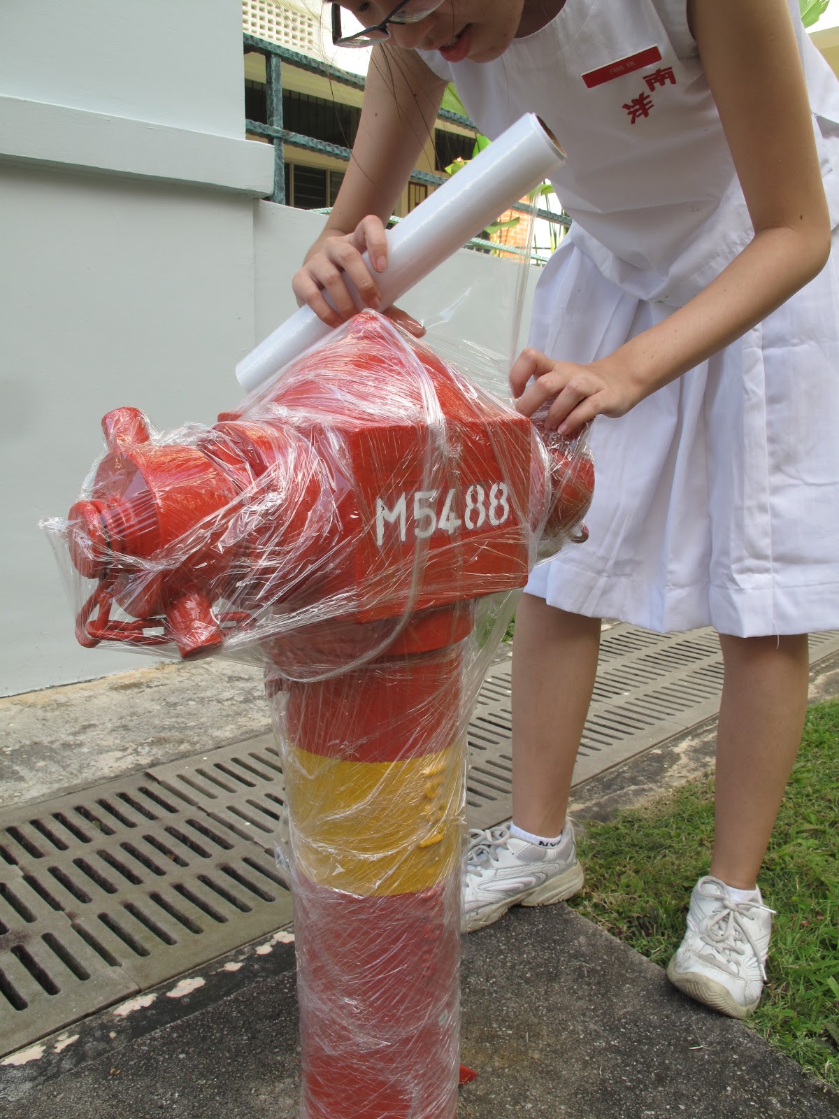
In Case Of Fire, Do Not Use This Fire Hydrant
Earlier this year, we AEP students were assigned with a task to wrap something in the school with cling wrap. This task is based on some of the works done by Christo, the artist we were just learning about. We went about the school in pairs, searching for something to wrap. We had ridiculous and unfeasible ideas such as wrapping a vending machine (which would probably get us into big trouble with the school as well) or wrapping a trash bin (the big green ones that can be pushed around on wheels) but in the end, Lero and I decided to settle with a fire hydrant (and up til now, I'm still not sure if that was really allowed, since it would be disastrous if there was a fire and the fire hydrant was rendered useless having been wrapped in cling wrap by us).

 |
| Me: Initial wrapping |
 |
| Second layer of wrapping |
 |
| Second last layer of wrapping |
Here are some pictures of Lero and I taking turns to wrap the fire hydrant, all the while hoping that a fire wouldn't start in the science block while we were doing so. We chose the fire hydrant mostly because of its strange shape and we were wondering who it would turn out after being wrapped with a few layers of cling wrap. It was fun, I guess, especially since the fire hydrant was something we decided was outrageous to wrap, yet not outrageous enough for the school to flay us or something (I hope). Anyway, Christo and Jeanne-Claude has wrapped quite some outrageous stuff before (buildings, a coast etc) and hey, if we're gonna do something inspired by them, it should be as outrageous too, right? Now I'm beginning to wonder if we could have wrapped something better--sorry if my definition of 'better' is a bit warped--like... a person or something...

This is the finished product of the wrapped fire hydrant. You can still see some red, because the cling wrap is translucent-ish and there wasn't enough cling wrap--but as much as I would prefer the fire hydrant to end up completely opaque, it wouldn't be environmentally friendly so... yeah. I think I like the knobbly look of the fire hydrant. Overall, it actually resembles something wrapped in thick spider web (which is nice~)
In conclusion, I think I just may understand why Christo and Jeanne-Claude like to wrap things, exploring shape and texture and art. But it's a waste of resources and that's one thing I don't really approve on. And some of the things they wrap (such as the coast) could affect nature quite a bit too. Like the little critters that live there or something. Anyways, this is their website: http://www.christojeanneclaude.net/index.shtml if you're interested to know more about them.
Off topic: We unwrapped the fire hydrant later and there were a little flakes of red that came off with it. At least the fire hydrant remained red enough. I think it had just been newly repainted over the school hols that's why... =="
20120107
SAM
I remember going to SAM at least three or four times before in the last three years, but I only have a record of pictures taken from the two trips in Sec 2. I took many pictures... pictures of the artwork I found interesting. the pics shown here are the ones I liked the most out of the several I took. The problem is, I forgot to record down the names/titles of these artworks and their artists and their mediums so I can't exactly label them... T^T
This first art piece was done on a large piece of paper and stuck onto the wall in such a way that it looked like the picture was actually drawn onto the wall itself. I find this one quite cool, intriguing, creepy (ahahahaha... ^_^) and interesting (mostly because its creepy.) It's black and white and I think it was done using charcoal, which gave it a really haunted kind of effect... like the very picture of death or something. The whole thing depicts a hell lot of tortured looking people, limbs and faces merged together in a mass of twisted black and white. the contrast and shadows are nice. You can see where I get morbid inspirations from. hehe XD

This second art piece was done on a canvas, so I'm assuming that its either acrylic or oil (the latter being the more likely.) I was attracted by this piece of art because of its bright and vibrant colors and realistic depiction. At first glance, you could almost believe that this was a photograph of a boy sprawled on his table top, a glass jar in his arm with a study shelf in the backdrop. Upon closer inspection, you can see the various items that make up this almost realistic piece of work: the books (two of which looks like the science o-level text/guidebooks I bought last year), some cds and dvds (which can also be found at home) an alarm clock, spiderweb (which I have observed several times and have tried to learn how the artist painted them so nicely) and last but not least, various containers (cups, jars, bottles) that each contain a miniature version of the main (and 'original') boy sitting at the table. The mini-boys are mostly either relaxing, sleeping, reading and they see to represent the main boy's various selves. One of the mini-boy is depicted punching a hole through the glass of the jar he is 'kept' in, and there is a mini-boy sitting in a flask with a starry night picture streaming into (or out of?) it from the illustration of a van gogh book. There's even a boy in a cup of water with a black goldfish in it! I love this sort of surrealistic stuff.

This third art piece consists of a sprawling rose plant cut out of one giant piece of white paper. It also occurred to me that the overall shape of the rose plant seems to form a double helix DNA-ish shape... hmm... anyhow, I was really impressed by how the artist cut out and form all those trailing leaves and rose blossoms. Just drawing a rose is hard. Cutting out a rose is even harder. using one giant pieace of paper to cut out a rose plant is nigh impossible for me. Origami rocks!

This fourth art piece consists of a circle/cluster of glass spheres hanging above a silver reflective mirror-like platform and shone upon by a spotlight. This causes each glass sphere to gleam like lanterns or shining globes/bubbles and due to the dark background, the stings by which the glass spheres hang are near invisible. below the glass spheres, the reflection of the spheres upon the silver surface resembles hundreds of black circles of different sizes. The effect was quite mesmerizing.

The last art piece is a shelf filled with bottles and bottles and more bottles. XD I'm not sure what could have been in those bottles... snuff? drugs? random chemicals? I like to think its poisonous... hehe. i think the designs on the bottles are interesting though and the overall look of the whole artwork. And after looking at all the above artworks... I'm stating to feel stress and depressed about the thought of having to come up with a satisfactory coursework (yes friends, laugh all you want. i know you know by the time I really do feel stress, yo would be suicidal).

20120106
BeiJing doodles
Just to let you know, the artworks I post up here aren't in chronological order. Okay, so the next few pics are of the stuff I drew during my GCP trip in BeiJing. The first four are designs my roommate, Kai Li requested me to make. The first one was originally something I drew without any intention for anything (except maybe alleviate my boredom) but halfway through, when i was asking my friend what else should I add to the cluster of random little things that I was drawing, she said "Hoya" which was the name of some k-pop guy she's crazy about, so i added his korean name in it. In his design, you can mostly see items I would relate to water or bubbles or round-ish stuff, such as a coconut tree, a whale, a shark, a scorpion (which taste like ebi tempura), an eye, a turtle, octopus et cetera.
The second one was done with the Alice in Wonderland theme in mind, so you can see the Cheshire cat in the middle, circled by the dormouse, red queen, tweedledum&dee, white rabbit with his giant pocketwatch, mad hatter, Alice herself with her face colored in black, and a unicorn (which is a character from the Alice in Wonderland book written by Lewis Carrol--not the one by Disney) Then, in her usual fashion, Kai Li pops in and insists I do something for "L"(that's his nickname, I forgot what his Korean name is)(oh and this is another K-pop guy from the same band as Hoya and is the obsession of another friend of mine) since I 'did something for Hoya'. So the block and square background of the Alice in Wonderland icon (i honestly do not know what you call this sort of thing) was inspired by doors, books, Cubism (I can't believe I'm saying this) and the letter L.

The third one was specially requested by Kai Li. She told me to do something for Jill (another friend crazy over the same k-pop band, particularly someone named... darn it. i can't remember what's he called) and so I made a design for her with the korean name of Jill's 'idol' (which i do not remember and cannot read cuz its korean) in the middle and added a ball labelled 'netball' in one corner cuz Jill's a netballer.

The fourth one is the last of the unintentional k-pop series (how on earth did my lovely innocent designs end up with k-pop??) and was designed for Kai Li (again) who wanted a logo (finally, I found the right word to describe these!) for that particular K-pop band (which I have no care for... what I care for is the design) called 'Infinite'. So I wrote the korean words approximately in the middle in bold, I drew their 'infinite' sign behind the words and added my usual little elements around it, using squares, blocks, the outline of a cog/wheel/gear, the four suits (heart, diamond, clover, spade) of poker cards, a fish-like design that I took from henna drawing and the erratic heartbeat lines that form the word 'Infinite Ftw'. This one was done on a black sheet of paper with a white pen.


Death of Caesar
Okay, so this is my first post... don't really know what to say... I think I shall start with the background of my blog title. I call it Caesar Salad cuz it was inspired by Julius Caesar and I don't know if you can see it clearly, but there are like humans er... forming the blood/cap of the toadstool (toadstools are poisonous by the way) and the stalk of the fungi has skulls merged with it. A bit morbid, but you know me... loves sadistic pineapples but before pineapples, i was crazy over mushrooms and toadstools don't ask me why. I did this last year and I intended it to look creepier... don't know if I succeeded in that aspect. The lemon slices, cherry tomatoes, and random vegetables are just there as food deco, and to contribute to the 'salad'... the main subject is, of course, the toadstool. I've always imagined this kind of poisonous mushrooms as red and white. The red was convenient as not only does it say: warning! I am poisonous and not to be eaten! but it's also the color of blood (albeit a bit too bright red for real blood but i thought this shade of red would stand out more so...) As for the stalk, I didn't exactly color it white cuz white is a bit too plain and I don't think the stalks of real mushrooms and toadstools are really white anyways, so I used beige and conveniently added skulls (which are also things that are white-ish in color) to it. I used the melting wax of candles as reference for this part. Did I mention the toadstool is black/hollow inside and is purposely colored to make it look half rotten? And the part where the knife (yes, its a knife, although apparently, after what some people said about this artwork, it looks like a spoon. Does it??) cuts through the cap of the mushroom was inspired by all things slimy, gooey and gruesome. The rotten part of the fungi was also made to have a vein/blood vessel/root/parasitic look. You can imagine my delight when I was told we were going to dissect a pig's heart later in the year. This was done using color pencils, a black, a red and a white pen. oh well, the original's below (the pic above was slightly edited using... i forgot. Photoshop i think):

Subscribe to:
Posts (Atom)